What's new?
Go ahead and check out your site-level clients page to see a few graphs we added recently:
-
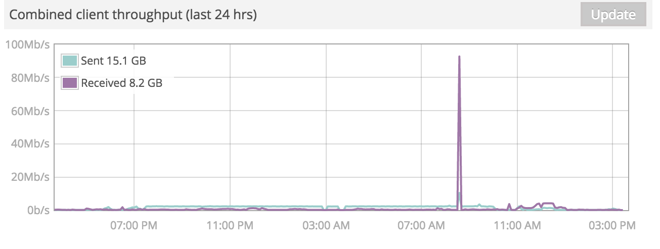
Combined client throughput graph over the last 24 hours: This graph will quickly give you a view into the overall wireless activity of your site over the last (rolling) day. You can click and drag your mouse across the graph to zoom in on the data.

-
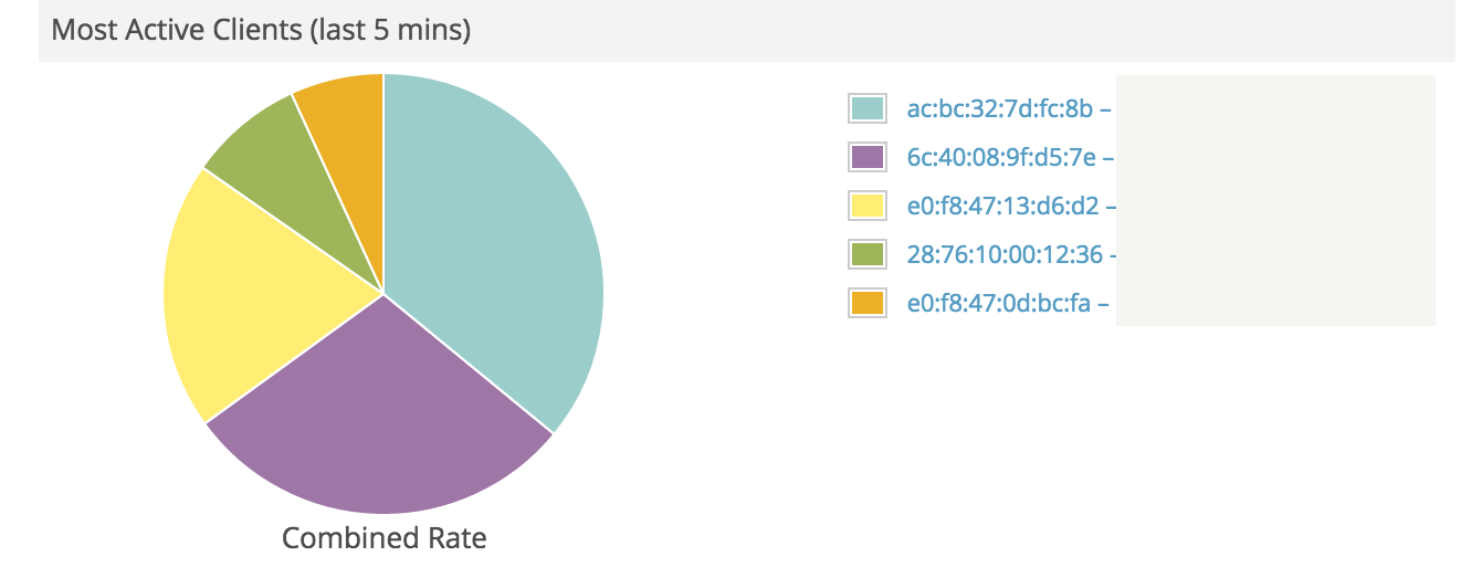
Most active clients (last 5 minutes): This pie chart can help you quickly identify the clients who are currently generating the most traffic. High traffic clients can potentially indicate that someone has a virus, or that you need to implement rate limiting in order to share the bandwidth across your users more fairly.

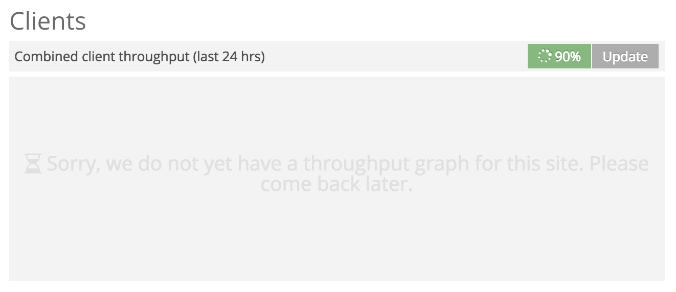
NOTE: The first time you view your site-level clients page, the system will need a few seconds to process and cache your client data. While this is going on, your graph will look like the picture below. After initial caching is complete any return visits should load faster.
